Thursday, February 01, 2018

State-of-the-art 3D Printing in the Design Studio

The increased use of 3D printing in the design office will continue to be a trend in 2018. Normally I'm more focused on architectural 3D printing – on a scale of which one can walk through – however, being smart about the adoption of technological innovations in the office is also important if one wants to build a lot of quality architecture, and here I argue desktop 3D printing has a role in potentially helping save money and increase building design quality. 

A custom architectural light manufacture in California whose pieces average $3000 each recently reported a savings of nearly $90,000 over 40 projects in 18 months with the purchase of an inhouse 3D printing unit. I suspect some costs aren't captured in this estimate because there was probably some initial training required to operate the 200 Series Workbench Classic from 3D Platform efficiently. However, once the unit had a fluent operator, the designers and fabricators' ability to study the proposed design before final production was greatly increased, helping ensure the piece had the form and qualities expected.

Architecture and engineering firms will not be responsible for developing robotic 3D printers. That will continue to be very specialized knowledge. However, one of the most important points to leverage in the design process is the smooth transition of data from prototype to production, with ideally as little post-production as possible. This idea scales to include architectural 3D printing as well, wherein the engineering characteristics of the model to its final production shift even more. One can't cleanly print the REVIT model without some sort of post-processing, either automated or manual. This is again where the topic of data science has the potential to help the most because abstracting the problem to one of data is the type of knowledge needed to effectively design and produce such models, and it's already well established and studied through the field of computer science. 

Having a tangible scale-model supports the design process in other ways beyond the ability to rapidly prototype ideas. Having a model to study also increases the design team's understanding of the proposed building's spatial qualities. One company doing interesting things with scaled models of urban areas is Chicago's Microscape. These city models allow design teams see how the proposed building integrates into the urban fabric and their quite beautiful in their own right. Many clients report loving the tactile nature of these sorts of presentation features, and I think this enthusiasm should be encouraged. If I had to say why clients find such models helpful, I would suggest it's because the models offer more dimensions than 2D renderings to understand the space. This quality is important when clients are trying to understand and solve functional problems with a spatial component. And I would go so far as to say this quality is helpful to designers as well. 


Wednesday, January 24, 2018

Sustainable Engineering with Renewable Materials


One of the most innovative buildings built in Canada last year might be one of its most unassuming. Brock Commons Tallwood House on UBC's campus was completed late last year set to be used for student housing. Aesthetically, it comes in about average. The design has stayed with a cost-effective rectilinear form, and the designers have tried where they can to accentuate the exterior facade. What is worth noting, however, is the project's use of innovative materials and building techniques. 


One of the most interesting implications of tall timber structures is that it essentially deepens the number of ways buildings can be solar-powered. Steel and concrete, while contributing to the great heights achieved by modern architecture, also have correspondingly large carbon footprints. Another way of saying it is that steel and concrete are very energy intensive materials to produce. On the other hand, using timber means the growth of the building comes directly from a renewable resource, and that the Sun does most of the work. One can also assume that as time goes on, the carbon footprint of manufacturing and transporting the timber will continue to decrease as manufacturing plants and vehicles become more energy efficient (this point, of course, also applies to steel and concrete production as well). Increasing the use of renewable materials supports the AEC industry's goal of promoting sustainable design. 

To date, there's not a lot of in-depth research about the effects of fire retardants used on mass timber projects. It's definitely a necessary step, as such a building can be viewed as a humongous bonfire, and fire retardants of past decades are now seen to be harmful to human health as they tend not to stay inert in the wood forever. Essentially, the fire retardants need to penetrate the deep into the wood. No doubt this risk was considered at some point in this project, however, I can't yet point readers to any sort of in-depth reporting expanding on the modern use of fire retardants in these types of buildings. I have also heard reports from the UK that sound transmission through mass timber structures can be exaggerated compared to a concrete high-rise. Mechanical energy waves like someone dropping a chair can travel quite far through the timber beams and columns. Decouplers installed between columns and beams can stop mechanical energy noise from transiting through the structural system, but I don't know if any were used in this project. Something to keep in mind as you try to get a good night's sleep in a timber high-rise.  

What I really like about Brock Commons is the modular nature of its building process. Different types of CLT panels, columns and beams were used in combination to complete the structure. It reminds me so much of LEGO but its practical implications for the construction process are immense. It's another good example of how BIM technology brings the construction process earlier into the design phase. Here a lot of the credit goes to Fast+Epp Engineering for structuring a wooden building this tall. The modularity and pre-fabrication of the design had two main benefits of increasing tolerances (for better building performance) and speeding construction. Each of which contributes to the cost-effective and sustainable nature of the design. Timber buildings this tall are not necessarily experiential, but they are a type of specialized engineering as the types of forces put into the timber are quite different from that which normally found in the residential market. In all, I think it can be confidently stated the industry will continue to see an increase in the use of this type of technology, and readers are well advised to familiarize themselves with this type of construction.  


Wednesday, November 08, 2017

Mobile Construction Apps In Theory and Practice

This article developed in a very unexpected way: Structures are almost always built from the bottom-up. However, the design process can also be construed as information flowing to site. This is what motivated me to research a selection of the top mobile construction apps on the market at the moment to better understand how my work was being used downstream. And this idea in turn started a long trip down the rabbit hole…

Key to being effective in the design studio is understanding how the construction drawings I produce are being used. More and more this means my drawings are translated into a digital format appropriate for display on either smartphones or tablets. Not taking care to understand how construction drawings are being used downstream raises all sorts of risks in my mind, mostly anchored in their unexpected behaviour causing inaccuracies and then errors in the final building. Why put such great effort into creating quality construction documents then only have it marred by poor execution due to technology. If there’s something I can do upstream to help make my project partner’s lives in the field easier — inevitably something easy like pressing the right button at the right time in my workflow — I’m fairly confident this small effort on my part can raise the quality of the final building.

It was with this in mind I started investigating some of the top mobile construction project management apps available in North America. I don’t have access to a project on each platform to compare directly but it’s quite a competitive space at the moment, and there were ample materials available online to compare. One interesting theme that developed which reinforced the competitive conditions of the marketplace was that each was similar to the others across several measurable characteristics. Economist Michael Porter argues that this is exactly what happens as markets become more competitive. When any one product is lacking a feature — documentation, interface, compatibility, etc. — it harms the product in the marketplace because the lacking feature really stands out and swapping to a competitor is very easy without losing other important features. This is in contrast to less competitive fields where innovation stagnates. A product in a less competitive market can often survive with fewer features than the class leading product if it has one feature a core segment of users considers invaluable. There are multiple examples of this type of behaviour in various niche software segments.

Construction apps, on the other hand, play in the fiercely competitive field of the app store. The market is expanding with extreme rapidity, with clones of clones not being uncommon, and several software developers have the capacity and resources to produce best-in-class products at any one time. This makes the selection process by the designer or general contractor more difficult. Very fine distinctions have to be made in regards to the final choice, often assessing several variables that can never truly be balanced. The sales reps of each company will no doubt tell you theirs is the best implementation of the technology, but, if quoted as truth, this kind of statement will be born out by observation as well. But what is really striking is the degree to which these platforms have converged.

I took upon myself the burden of seeing ads for this construction app across the internet for the next couple of months as a result of researching this topic. These companies are actually quite aggressive, even displaying ads when searching for their competitors. The best way to show the convergence is visually. This is no easy task since a majority of these websites use fancy HTML5 implementations that fade and zoom graphics across the screen. Still, capturing what I could and comparing them side-by-side is illustrative. They’re all professional websites that are fairly comprehensive.
  • PlanGrid
  • Fieldwire
  • ProCore
  • Buildcloud
  • Geniebelt
  • Bim360
The websites all look similar.

The apps also all look vaguely similar.
One thing I think many people 10 years ago underestimated was that it would be the construction industry driving technology adoption today in the AEC industry. Certainly with BIM, the previous marketing effort was mostly directed at design firms. The theory being that the technology would then flow downhill through the design and construction process. Recent conferences I’ve been to show a different outcome, with strong adoption of BIM in the construction industry because of its strength in supporting detailed scheduling and reporting tasks. Many architects still cling to the purity of hand drawings, while engineers continue to be frustrated by BIM’s perceived clunkiness, but there seems to be some level of measurable improvement in the construction industry through BIM.

Construction project management apps have seen similar strong adoption. Canadian builder Ellis Don and construction app Fieldwire presented some interesting numbers at a conference I attended earlier this year about a recent survey of its use. Two conclusions can be drawn which could be helpful to readers. Firstly, with everyone on a construction site pretty much all carrying a smartphone in their pocket and reasonably priced tablets available widely, the distribution of the app was simple and responses positive to its use. Surveys showed people generally liked using it. This really shouldn’t be surprising since we’ve all become familiar with using apps, finding certain ones essential, and others just plain addicting. Secondly, the ability for people in the field to highlight problems in construction, and then streamline the data’s prioritization through all sorts of meta-data and filters offered a measurable process improvement. This resulted in drastic reductions in the time it took to analyze and produce reports simply because the higher quality data having come from being inputted directly into a digital medium with all the accompanying metadata and tagging correctly attached automatically.

How To Chose An Construction Project Management AppAfter showing examples of convergence in the marketplace, the question of choosing an app still stands unanswered. Here I am a pragmatist. I’m absolutely convinced of the utility of the technology, but their convergence in the marketplace needs to be accounted for in the decision making process. A general conclusion that should be a relief to decision makers is that, at this moment in time, it’s far more important a project utilize this technology than exactly which platform is selected in my opinion. If there is anyone variable to use in making a choice I recommend looking at the cost of per app installs. This can be quite high, ranging from $15 to $300 per device, depending on the company and configuration. In contrast to their fully-featured websites, the companies have tried to keep their exact pricing structure for large organizations obscured.


Wednesday, November 01, 2017

What is Minimal Design?

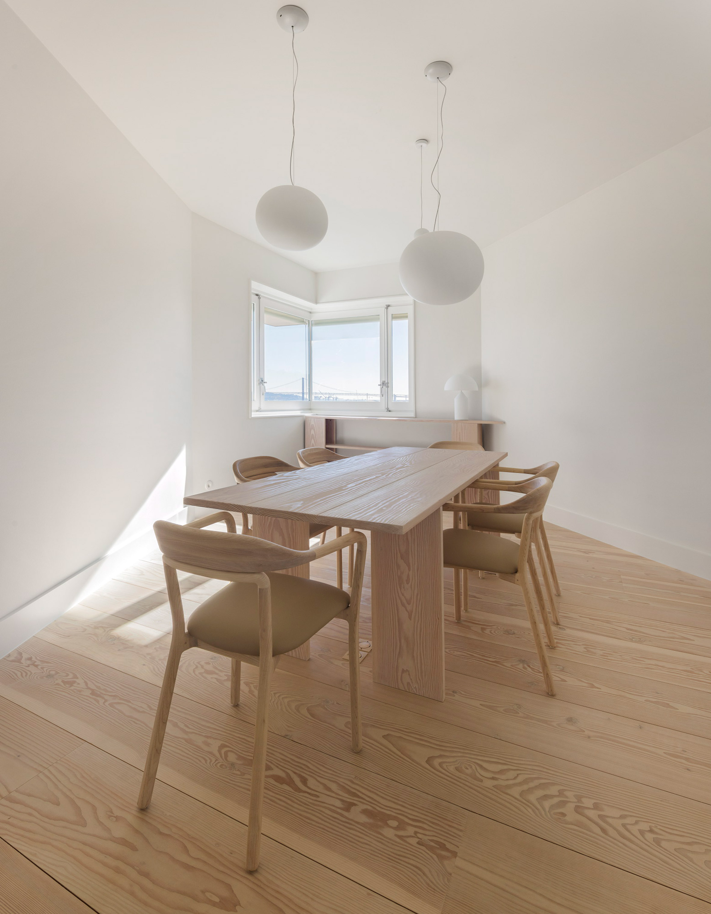
The connection shared by all the interiors below is that they are renovations, an important subject as we aim to increase the sustainability of our buildings through reuse and adaption. This piece features one house and two apartments, any one of which would be hard to locate in the world because the stylistic choices made are decidedly international in flavour; a point I will try to reinforce by not revealing their locations. (Though I will, of course, give the designers credit, and readers will be able to reverse engineering the project's location from that.) 

There are no immediate hints at the regions these designs hail from. For this reason, Minimalism is an excellent foil to our architectural criticism as it's a complex style to analyze because of this feature, and therefore its details become important to distinguishing good from bad. Taken as a group, one of the broad themes seen in the examples are that it's hard to balance the good characteristics of minimal design – the refined expression of form, the bright and open interiors, etc. – without having the interiors careen into a style that's sterile and unstimulating. One can almost feel the sharp edge everywhere.

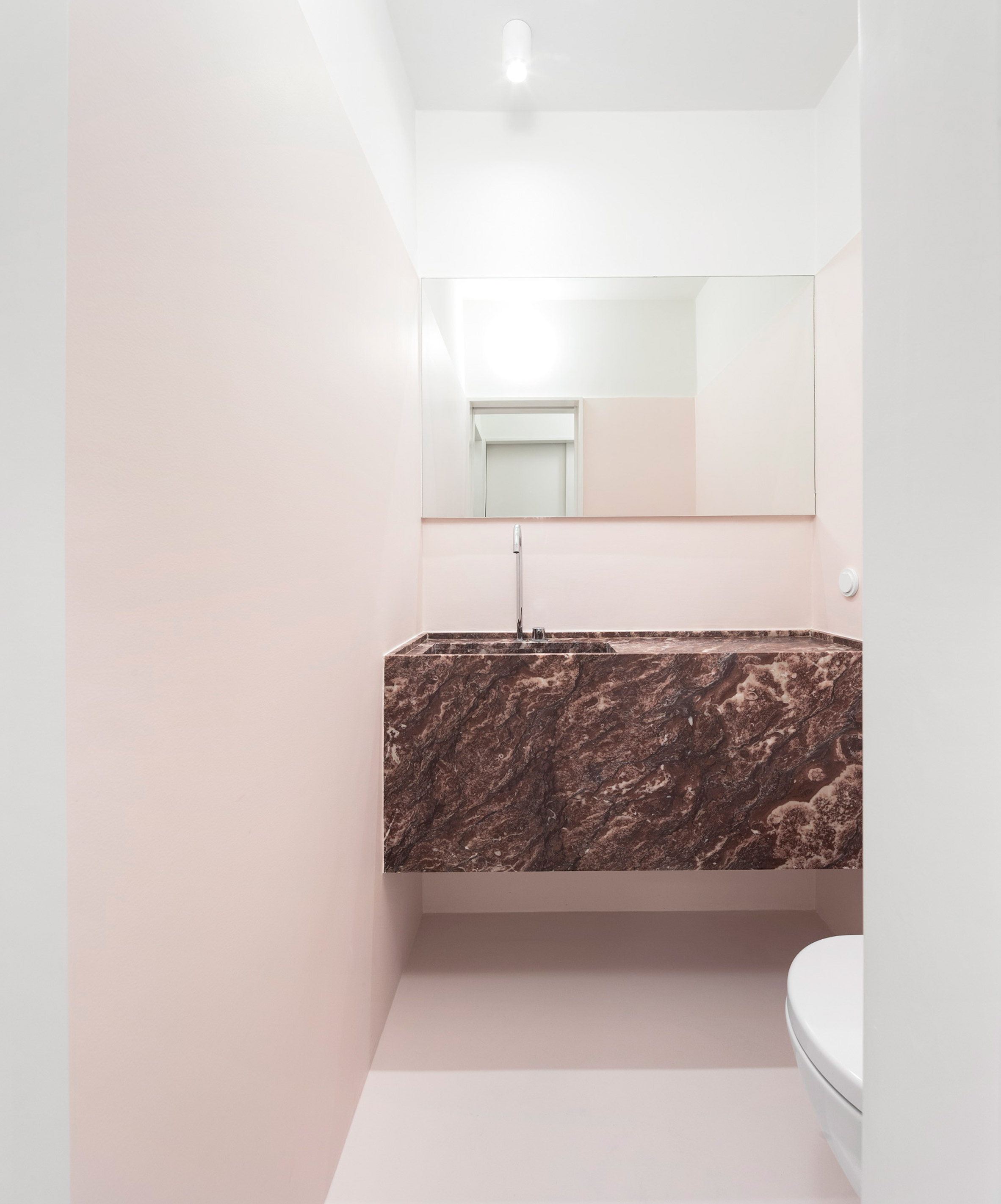
First up, designer Rita Aguiar Rodrigues was tasked with renovating a series of suites in a 19th century apartment block. These interiors are so spartan they barely looked lived in. And that's a sad characteristic because it's like a musical instrument that never gets played. The only dinner party I can imagine occurring in the dining room is silent without eye contact. The baseboards and trim are reduced to a minimal profile, with the original wide plank floorboards refinished and greatly lightened to brighten the interior. One standout feature of these apartments are the bathroom suites use of marble. Super beautiful and probably quiet pricy if they also sprung for the fancy nickel-plated Moen faucets. 

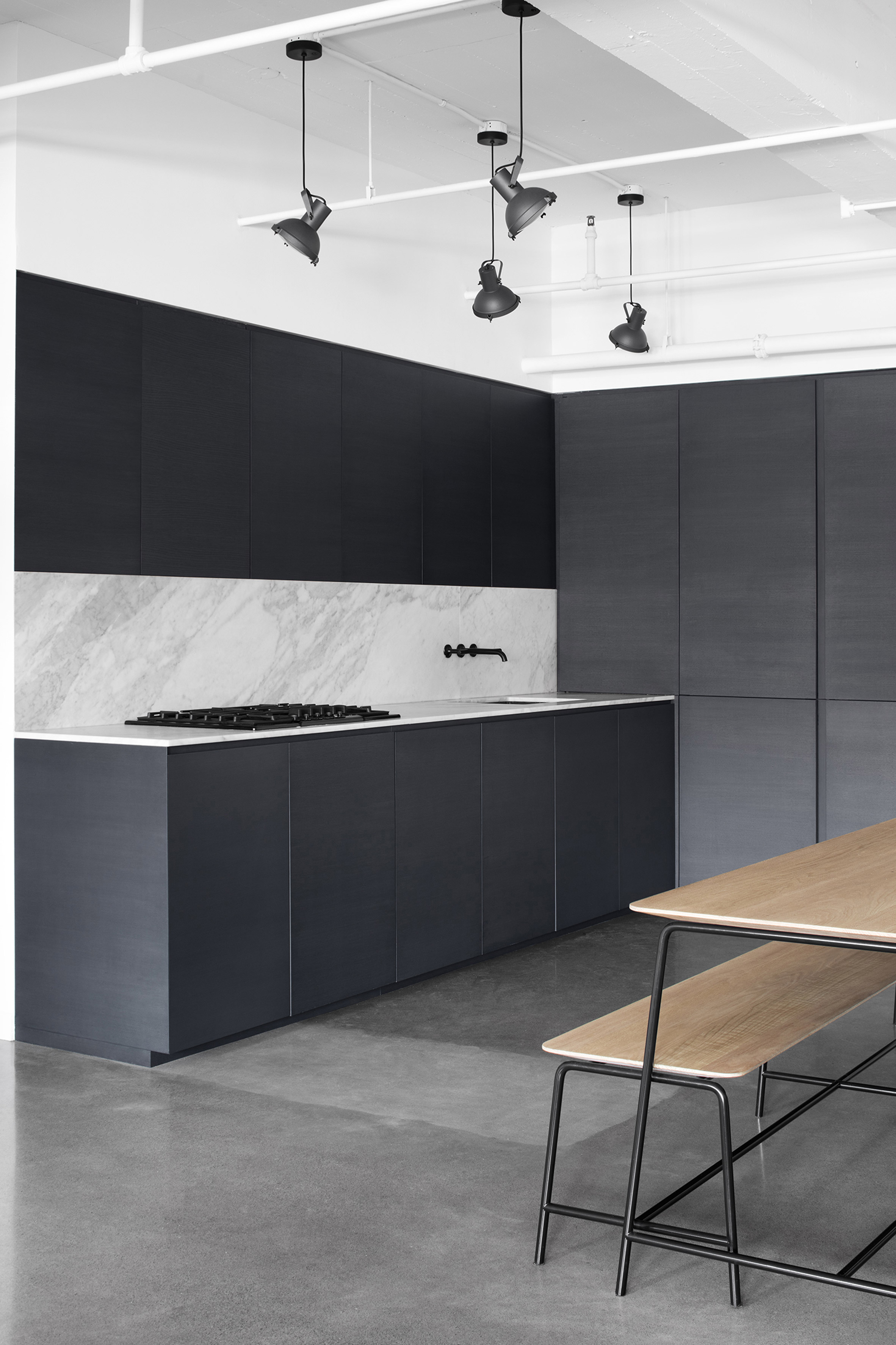
The second example from Atelier Barda does have some important context which informs the design. The apartment was actually renovated for a high-end fashion label to use as their guest apartment for visiting collaborators. Therefore, lacking of some personal touches normally associated with a home is more forgivable in this example because of its function as sort of a private hotel. The rusticated and unfinished materials I can live with but I find the kitchen a puzzle. The dark finishes are sure to make one's food look less appetizing and hide how the drawer and cupboards operate. Have you ever been stumped as to how to open a modern cupboard door when all you want is a glass of water? This kitchen embodies that quality. It's hard to even tell where one door ends and another begins. Benches in the kitchen can also be less inviting to cosy up on, assuming one finds enjoyment from entertaining in the kitchen in the first place I suppose. The thin style of the table mores it far away from feeling substantive and grounded. All of this might be forgivable if one accounts for the use of the property as a statement for a brand. So while the architectural risk taking should be applauded, I'm not sure if the results don't land somewhat flat-footed in everyday functionality. 

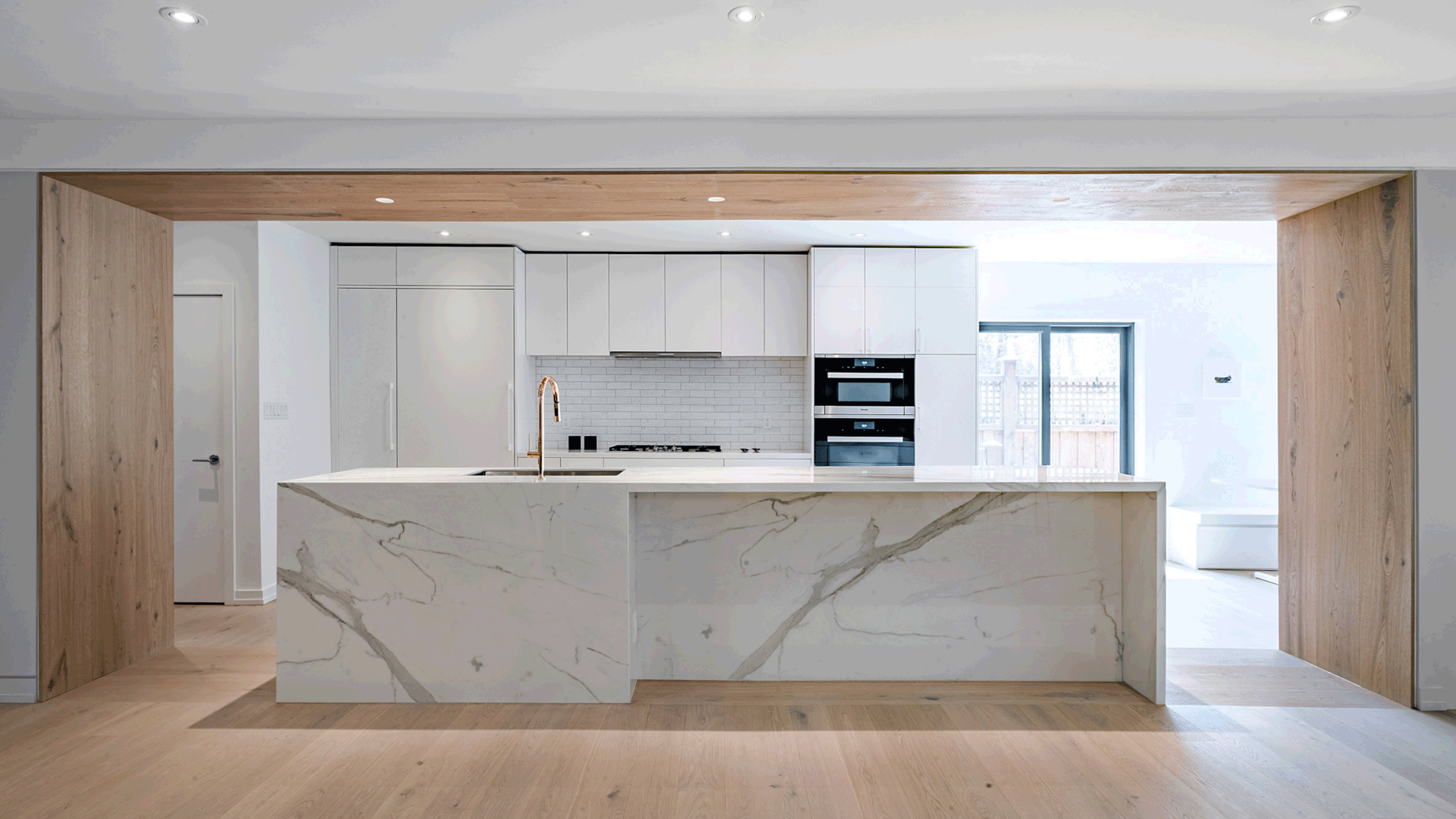
Lastly is Studio AC's renovation of a long narrow two storey house. The interior is a big improvement for a house built in the 1960s and now daylight spills into the interior. Again window and door frame profiles are kept to a minimum, but more use of warm wood textures throughout keeps the interior from feeling sterile. There are some very odd choices of architectural features like the barn-door style door on the master bathroom and fireplaces stuck everywhere but not made to be the focal point. One can look past these quirks if the client really liked them, but at the end of the day there seems to be very little storage for the family's belongings. Where are all the books and family photos? 

One huge home run for this house is the kitchen. Modern cabinets guests can still open with other convenient features included haven't been overruled to make a design statement. The wood framed square arch is great; at once accentuating the form and adding warm textures to the interior. The two marble pieces featured in the island are sculptural in and off themselves, and I think are design choices that will age well. 

Wednesday, October 18, 2017

Evolving Types of Architectural 3D Printing

Architectural writing allows me the advantage of taking an outsider's view and crash technologies together to draw conclusions. This is why I wanted to bring to reader's attention four current projects that blur the lines between drones and 3D printing on the construction site. This top-down approach is vital to smoothly integrating them into the modern digital design workflow. Ultimately, if my argument is that additive construction techniques are cost-effective and have the potential to raise the quality of the built environment, being open about their research characteristics now is important while they develop into mainstream products of the future. Experimental projects, while valuable learning opportunities, also tend to be prohibitively expensive as positive results are chased with near endless grants to move the subject matter forward. Quality design on a finite budget–big or small–is where most of the market is.

The wonderfully name Ceramic Constellation Pavilion recently erected in Hong Kong shows the sort of slow evolution the industry is seeing (left). This project does have precedents (the though article states "it's the first in the world") in UCLA Berkeley's Bloom 840 piece 3D printed structure(right). The ceramic pavilion increases this to 2000 uniquely printed bricks and makes improvements in the 3D printed material. Whereas Bloom used an esoteric mix of experimental cement, the Constellation project manages to reduce costs by modifying more readily available terracotta. There's an ingenious interlocking brick design used for the structure in which each brick is unique and contributes to the overall final form of the structure, a quality only achievable with architectural 3D printing. But that leaves one important question, what poor soul was responsible for piecing this whole thing together? 

Students of course! The Ceramic Constellation Pavilion being a project of the Robotics Lab at the HKU Faculty of Architecture. But I have a better idea. Or at least argue strongly for a better approach as I only wish it was my idea. For example, 2012 brought a new method to the construction site of letting robotics do the work of placing the bricks. Flight Assembled Architecture was a highly experimental structure, being led jointly by ETH Zurich for their robotic expertise and architects Gramazio and Kohler and Raffaello D`Andrea. Erected in France out of styrofoam bricks it distinctly falls short of what I had in mind. Nonetheless, it easily shows the potential for simpler modular bricks to be placed in a such a way that a more complex form emerges from their arrangement. Patterns can be programed that would drive labours crazy in the real world because of their high-tolerances. This is the exact quality which will allow construction drones to raise the quality of our buildings. It will reduce labour costs while being more effective, but the drones are also more accurate than humans can ever be. With homes and offices built to higher tolerances, one would expect a corresponding increase in quality as well. The exterior could be sealed better against the elements with better placement of insulation etc., each of which contributes to better thermal performance of the structure. 


Since 2012, people have continued to create robots that build and design. A recent project I thought was just great for showcasing the developments in the field was Arup's participation in (the misleadingly named) The DNA of Making in London (see video below). A project in London which features the use of a crazy looking robot which balances itself on wires, controlled by AI, to create and construct the design. I end on it to reinforce that we should be open minded toward what this technology might eventually look like on the construction site. (Sorry about the obnoxious autoplay. Blame Arup.)

Wednesday, October 11, 2017

High Performance Teams Design High Performance Buildings

This piece is mirrored from where it was originally posted on Medium.com.

A connection of mine on Linkedin last month posed this question on her feed: “How did you become a REVIT expert?”

This struck me as a particularly good question to ask because I think many firms at the moment are trying to improve their performance on BIM projects. To answer is with enough substance to affect change, however, requires a non-trivial effort. A challenge I am up for. Furthermore, I find leaving long replies in those little comment boxes in poor taste. So while they might not have been the right venue for substantive change, I still think a full answer has value. Therefore, though it has taken me a while to circle back around to the topic, what follows is my best attempt at answering her question honestly and thoroughly. We begin by describing some of the answer’s characteristics before turning to the ideas alluded to in the title of this piece.

The first step any organization can take to start increasing its expertise in BIM is to separate the issue from graphic design. This point is often missed in discussions about BIM. I advocate making a hard break between the topics because they’re two different skills sets in my opinion. To understand how they’re different it’s best to use an analogy; they essentially require different types of exercise to improve. The cause of this oversimplification is understandable when comparing senior drafters with three decades of CAD experience to recent graduates using REVIT. Thinking critically about these differences reveals new solutions.

Once the separation is made, one suggestion to improve drawing quality is to consider implementing more Information Design in the production phase. I love construction drawings; draft for fun in my free time; and would happily hang good examples on my walls. But I’ve always adopted the approach clients are better served by looking at the output of a complex physical building in 2D linework as essentially an exercise in information design, of which graphic design is a branch.

Having thus established reasonable limits on our discussion, I wanted to take a moment to deconstruct the system we are trying to develop expertise in to make potential solutions clearer. The formal subject of Systems Theory has a lot to say about how we should approach complex software because it immediately excludes certain problem solving strategies one often sees employed in the field which can lead to frustration on the part of the user. My six years of experience as a systems analyst at a telecommunications company has many parallels with my expertise in REVIT now because of similarities in the nature of the complex software we trying to use to solve non-trivial problems. Taking moment to quickly outline my background, my previous department of 140 people provided technical support to 3000 frontline agents. Our department was their technical helpdesk (among other duties such as analyzing order fallout). As it turns out, telecommunications systems are pretty complicated, and sometimes even helpdesks need helpdesks. That’s where I came in. A core group of 12 of us had advanced system access and training to support our team members, with the additional responsibility we try to pass on this knowledge to other team members when possible. The point to remember is that everyone in the department would have described themselves as an excellent problem solver, but how was I able to distinguish myself to join that core group of 12? I really loved the challenges of that position. It basically assured all the hardest technical problems across the country found their way to my desk; which is exactly where I wanted to be. The nature of the system meant many problems were totally one-offs––never to be repeated––mysteriously disappearing after being fixed. These are the sorts of unique non-trivial problems Systems Theory tells us to expect in a complex software platform like REVIT as well. I observed through my interactions with team members, however, many sought explicit rules to solve them, and this creates a direct obstacle to engaging the creative problem solving needed to tackle unique and uncertain problems. Experience is of limited use when faced with totally new problems like these. To start making headway on them draws upon skills that fall outside direct experience of building, such as critical and analytical thinking. Now we are truly ready to turn to what I saw in these problems which allowed me to help many team members and clients for my time there, and what makes me a REVIT expert and BIM champion now.

The Rocket Fuel of Creativity & Curiosity.
Returning to my colleague’s question, my first answer by reflex was “Creativity!” but I paused just long enough to overcomplicate it, remembering that curiosity, as the twin characteristic of creativity, was also worth mentioning. Considering another, and then another point that would support my expertise, I finally thought better of leaving a long reply. One needs to turn to the strategic decision-making literature or the cognitive neurosciences for the rigorous proof that such a connection exists between curiosity and creativity––that they are indeed opposite sides of the same coin––but a story from my problem solving experiences is probably more appropriate: When I sit with a colleague and try to help them through a difficult problem, one that I might initially be stuck on too, either in REVIT or telecommunications, what becomes apparent is that I’m magnitudes more curious about how these systems work, and how to use them effectively. I’d describe it as a burning and all-consuming desire to know how these systems work. And this approach, after a period of time, indeed bears quite a body of knowledge that can be helpful to the team if shared. Creative problem solving methodologies suggest one should be able to come up with as many alternatives as possible as a way of finding a solution. As a dimension of intelligence I’ve heard this quality be called analogical thinking. Working through a problem this skill is represented by the ability to ask many questions of a it––more than anyone else. Curiosity is the engine of this approach. Where some people can think of two or three good questions, I can fill pages. And as the problems become more complex, and more ambiguous, with more uncertainty, this curiosity in fact creates structure to the problem from which a solution can be found.

There’s actually quite a lot of further details that can be added to the model, mostly found in the two above mentioned topics in addition to the self-directed learning literature; a subject that for a long time was science’s only guide into unknown fields. The source of this creativity and curiosity in my character is a mystery to me, but I know as an adult it is not without conscious intent that I aim my creativity, which now offers us the requisite point to pivot toward how attitude plays a role in becoming a REVIT expert.

One of the best hints for problem solving at a high level is to quickly and easily admit what you don’t know about the problem, and to be able to make very fine distinctions in that regard––and again it’s curiosity that discovers ways to get that unknown information afterward. “I don’t know” are very easy words for me to say. I came into the world, and will exit it, knowing far less than all there is to know. Standing at the edge of my ignorance is like standing beside a vast and dark ocean. I don’t often get credit for this attitude because another characteristic overshadows it; I approach problem solving with great confidence and positivity. I learn exceptionally quickly; love architecture; and am so thankful that with practice I’ve gained an understanding of how things are designed and built. This positive attitude nourishes the problem solver as they encounter false starts, failures, red herrings, and more yet failure. If readers are looking for a more rigious description of how a positive attitude supports professional expertise, researchers Andreas Fink and Mathias Benedek’s in the 2013 book Neuroscience of Creativity (MIT Press) comes to the same conclusion: Positive affect, and even humour, are very relevant to creative problem solving. Now we finally have the background to consciously deploy these attributes on a team to more effectively use REVIT, or any software.


Cultivating a positive attitude in the office.
Working under the assumption that the main goal of a design or engineering firm is to build a lot of valuable architecture, and accepting my suggestion that attitude is a key characteristic defining BIM expertise, then how can one get a whole team going that direction?

Identifying obstacles that come up in the office which inhibit a positive attitude quickly show how to cultivate its opposite. In a stressful environment with a micromanaging boss, it will be hard to look upon a difficult task in a relaxed and positive manner. I’ve mentioned elsewhere in my writing I take a very ancient view of leadership, believing the human condition just too complicated to ever order someone to have a better attitude, and then have that directly translate into an increase of expertise. Our aim here is to try to unleash people’s motivation. The shocking view that leadership by listening is an effective way of creating a positive atmosphere in the office will come as a surprise to some. But UK business writer Jo Owen’s research in this direction concludes many leaders who others describe as a great leader have this trait. Helping so many people work through complicated ambiguous problems, I’ve observed they will often tell you what obstacles they are facing to completing the task successfully. Ask a few more questions to understand their motivation and then that can be engaged as well. As Jo Owen notes, the vast majority of people come to work and want to do their best. But how often do we let them? Part of my success on my previous company’s helpdesk was that I was effective at passing on my knowledge (and cheerfully fixing their problem). And this hinged on my ability to listen. I was sensitive to how my teammate was thinking about the problem regardless of how I was zooming toward its resolution in my own quirky way.

Design studios and engineering firms are not well served by assuming courses or experience alone bring expertise. It’s much more about preparing the ground to be fertile to positive ideas. No farmer knows how to––or would seek––to direct the growth every stalk. Instead they work to make the field itself healthy to better their chances at a fruitful harvest. This is the best frame of mind in which to try to affect positive change. Hiring for experience is a double-edged sword. Though certified expertise and length of service is an easier metric to compare across individuals, it doesn’t guarantee a hire has any inclination of giving their best effort toward the team’s shared goals, nor holds a positive attitude towards passing their expertise on to others. I leave the role of formal teaching to others who really have a passion for the subject. But I absolutely recognize that an important characteristic of good leadership is the ability to teach and pass on one’s sometimes unique and valuable knowledge in just the sort of cases discussed above. One can’t expect everyone to be at the same level initially, but it’s clear that sharing one’s knowledge is a winning strategy as it has the power to raise the expertise of an entire team over time. And if one’s goal is to build a lot of valuable architecture, the only thing better than one BIM champion, is being able to field a team of them.

Thursday, September 28, 2017

Attack of the California Bungalow

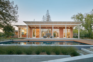
Taking a swipe at suburbia by being positive elsewhere, I wanted give credit in this piece to a residential style that perhaps deserves a little more attention. What a defines a California Bungalow? I realize now I’ve liked the style without a complete understanding of its characteristics. Will this post be improved if I stray into long description of the style? Probably not. Because a more narrow focus might exclude examples of good design we can learn from. Instead, we counter the risk of over-generalization by being as critical as possible toward the topic in an effort to understand its appropriateness in the 21st century. Just to put some reasonable limits on the subject so we don’t end up in the forest, three characteristics of the style as discussed below: Minimal elevation changes within the site, a bright and airy interior, and post-and-beam construction. 

Addressing the most trivial characteristic of the bungalow first: I’m not so strict on it being totally flat simply because a couple of steps up or down can contribute a great deal to making the design better by helping distinguish between functional areas or solving other design problems. Also, using elevation changes within a  site in regards to landscaping can ultimately make the property more inviting, playing to the natural strengths of a site. There is something to be said, however, about a pure bungalow because users with mobility issues deserve good design too, and I feel this is a population that has been underserved. There is also the fact to consider that implementing a bungalow design is not the most efficient use space. And this feature absolutely needs to be balanced in terms of its appropriateness for sustainable design projects. There are strong arguments to be made that if one really cherished Nature, and the idea of Wilderness, that stacking people is a more effective way to keep tracks of ecologically sensitive areas open for future generations. The dim alternative is to only value a tree once it’s cut down, keep building for the love of freedom, and let anyone younger than a millennial learn about grizzly bears on Wikipedia. 

There are several attributes of the California Bungalow where its light and airy nature contributes to the substance of why this style is such good design. I’ve always been attracted to the Canadian versions of this style (which are known by different names), because I’ve found the quality of interior daylight to be superior than another suburban homes. The long overhangs and skylights make the interior bright, but also limit high contrast areas of direct sunlight which aggravate the eyes. The marketplace doesn’t always acknowledge this as an important quality-of-life factor, but once people live with a space that has excellent lighting design, they notice its absence more. Drawing a larger conclusion about how our neighbourhoods are designed, and how characteristics of Califorina bungalow design can contribute to sustainable development, requires us to go all the way to Japan. 

Japan’s suburbia looks very different. The houses are smaller to be sure, but Japanese suburbia shares winding roads in common with North America suburbia. The easiest thing to notice by visitors to Japanese suburbia is that all the houses are oriented toward the Sun no matter how the road is placed. Of course, the designers make an effort to create a workable front entrance, but North American suburbia effectively ignores the Sun. Goodness knows how many millions of tonnes of fuel were wasted because of this choice. Japan is not more progressive for orienting their structures toward the Sun, rather it’s a design element that never left their culture in the place. As pressure builds to reduce our carbon footprint, bungalows in a California style can leverage solar power in several ways if more carefully attention is paid to the path of the Sun throughout the day. 

Another factor to consider of the open spaces in California-style bungalows is their multifunctional nature. As we strive to raise the quality of our sustainable design projects, the importance we place on spaces catering to multiple roles needs to increase. Multi-functionality is a valuable quality. A random suburban home that has a feature popular in the marketplace when built, in many cases limits reuse for a different function in the future. A slightly more granular view argues designing efficient multifunctional spaces is  paramount to cost-effective and high-quality sustainable design. 

Lastly, we come to the post-and-beam construction many California bungalows utilize. Often this feature is faked with just a couple of timber beams accenting parts of the structure, but several of the projects highlighted in this piece ambitiously hunt for a full expression of post-and-beam architecture. Certainly this premium adds meaning to a structure. Gamble House in the arts-and-craft style, erected in 1929 in Pasadena, Califorina, is an early extravagant example which references many of the qualities that would later come to be associated with the Califorina Bungalow, especially its emphasis on the horizontal. One can dig even deeper into architectural history and draw out connections from Japanese timber architecture to California bungalows. Japanese wood joinery in architecture is probably the preeminent example of the expert execution of post-and-beam construction techniques, and it’s hard to fault home owners for not waiting years and paying handsomely for traditional Japanese carpentry. So it's with degree of acceptance we see faux versions of post-and-beam in modern bungalows as aesthetically a good thing.


Flavin Architects
This firm develops new designs and renovates old bungalows. Some of the glass walls featured are very dramatic; if, that is, one is predisposed to living with their draw backs. High performance glass is expensive and some people don’t like wearing clothes at home (who knew?). 


Malcolm Davis Architecture
This is an excellent modern interpretation of the Califorina bungalow featuring materials taken from the site itself. Located in San Francisco, its oriented toward the great views offered from the site and captures well the openness of a California bungalow. The reused timber looks amazing and the interior is so bright and airy it’s at risk of floating away. 


William Berkes and Robert Brownell
Super amazing house with great multifunctional spaces. This example is included to round out the category of bungalows showing they can indeed have elevation changes on site or in the design. This house on the East Coast has recently been renovated and I think was very successful at creating a timeless modern style.

Tuesday, September 26, 2017

Architecture Inspired by Nature

This topic has a long history in architecture, all the way back to the Greek and Romans if one believes the comments of Vitruvius on the need for the harmony of Nature to be reflected in architecture. This piece reduces that history into a digestible comparison of Nature inspiring each both form and function. 


Nature Inspires Form
With the recent opening of the Chaoyang Park Plaza in Beijing, good design takes another step forward. Though some may quibble at the use of all-glass facades and the implications for the surrounding urban fabric of such large buildings — and those points are fair when perfect architecture is the goal — ultimately we try to celebrate architecture on this blog and therefore recognize the project for its creativity. 

The nearly 400,000 sq. ft. multi-building project mixes residential and office spaces in an area that was on a long downward trend before the project reversed its fortunes. Some of the landscape topography of southern China looks quite alien to Canadians, but was expressive and unique enough to traditional Chinese artists and poets to stir their creativity. MAD Architects state an ink-and-brush technique called Shan Shui was their direct creative source for these buildings. Why use the art of nature instead of nature itself to inspire? The architects themselves are mum on why but it’s reasonable to assume that one of the historic talents of Chinese artists was their ability to synthesize the essential characteristics of these landscapes in to a poetic form. The two tall residential towers are reminiscent of the ancient wind and rain eroded mountains of southern China, and the other tiered business tower is meant to echo the eroded stone outcroppings one would find along a river. Literature for the project stresses this design program is meant to facilitate a harmonious relationship between the project and it’s surrounding community, and formally I think the project’s final form was a great success.

Nature Inspires Function
If broadening our investigation to multiple fields, Nature has continually shaped science’s progress. Cancer drugs inspired from the alkaloids found in garlic; nanotechnology progress drawn from the scales found on butterfly wings; etc. Therefore, it should be of no surprise to readers architecture has also relied on Nature to help solve many pressing design problems. 

One of the most counter-intuitive requirements of a skyscraper’s structure is the need to allow a certain amount of engineered flexibility in the design. This is in stark contrast to our direct intuition about large structures as being static and solid. Taipei 101's structural system borrows exactly from this analogy to defend against earthquakes native to the region and the effects of strong wind during typhoons. Bamboo has a wonderfully playful nature in which it always pops back into place after the exerted force is removed. Here the architects chose to express bamboo in the final form of the building as well, but it’s bamboo’s characteristics of flexibility and strength that make it a perfect model for skyscraper design. 

Wednesday, September 13, 2017

The Cost-Effective Characteristics Of Additive Construction Techniques


I've been waiting excitedly all Summer to return to the topic of architectural 3D-printing. Finally the latest news coalesced into something of a coherent point about where this technology is going. I first wrote about the above friendly-looking MIT-created robot earlier this year, and it continues to be a convenient reference point from which to start our story: Construction drones and 3D printing are converging in ways nobody expected.

The design studio is still responsible for the design, but the algorithms used in its construction challenge the traditional architecture or engineering firm with a very particular type of expertise. It's a gap in skills I'm not sure exactly how best to respond to; except perhaps to invite in a 3rd-party. In time, machine learning will no doubt come to have a dominant role in streamlining the significant amount of processing needed to make designs machine-readable by construction drones. Some thought will also need to be put into the large geospatial datasets which have now come to represent the construction site, and the structure's coordination within it, because this process has emerged as an area of expertise. Construction drones et al. have to know where they are in 3-dimensions in order to be effective. These challenges might seem daunting to traditional firms, but in reality represent the strengths of digital technology. MIT's research, once refined and commercialized, will offer significant cost savings and increased accuracy when deployed. The construction site might ultimately come to have less people on it, but one, those are the client's savings, and two, lets not forget this shift is creating jobs too, just elsewhere. Getting back to my main point that additive construction techniques are more cost-effective, I argue that firms who start to learn and develop expertise in these areas will begin to gain a competitive advantage against others in the marketplace by potentially offering a cheaper building on a per square foot basis.

A good analogy for why additive construction techniques are so cost-effective can be seen in the use of 3D-printed sand cores in the metal forging industry. ExOne and Voxeljet are two such companies offering the service. Complex sand cores can be built up of whatever component the client needs greatly shortening the production cycle for the final part. There are also active projects researching methods of printing metal directly from a metal-based ceramic-polymer or powder. FromLabs is probably the best known but the field is competitive and many different companies are growing quickly. The fascinating thing about 3D printed metal is how it's managed to advance the subject of material science itself. With all the innovation that's occurring in the field, materials have started to emerge that blur the lines between what is a metal, ceramic or plastic. Australia's Swinburne University of Technology's recent work refining the cementitious material mixture used in architectural 3D printers shows promising results in this vein. The process uses sand and various polymers to create a 3D printed material that shares many characteristics in common with sandstone, but with the added benefit of allowing customization to better suite the goals of the project. Scaling up, D-shape is a UK-based company trying to achieve structural 3D printed concrete. Again – very exciting technology – but limited by its structural qualities. Cementitious 3D printing has the advantage of not requiring formwork, saving both time and materials, and highlighting the fundamental cost-effectiveness of additive construction techniques.

Another way 3D printing is fermenting radical change in architecture is by opening up the possibility of new architectural forms. Again we turn to MIT to reference developments in a new type of structural system made possible (or at least made greatly easier) with 3D printing. Force-line structures have a healthy background in applied mathematics and engineering, but now find expression on the construction site through MIT's research on Stress Line Additive Manufacturing (SLAM). Precise placement of the extruded 3D printed material is key to these structures' strength. With time, methods can be found to optimize material usage and that, combined with the lack of formwork, potentially makes the technology very cost-effective to deploy.